
It’s been a while since I’ve been able to post, but I’m back for more! I’ve got quite a few things I’ve been working on lately, so this should be the start of many more posts to come.
With the 2009 baseball season quickly approaching, I thought I’d start off with a baseball-related post.
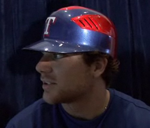
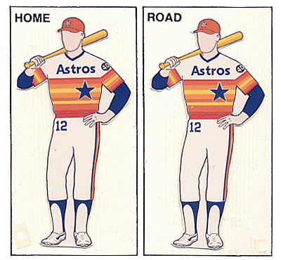
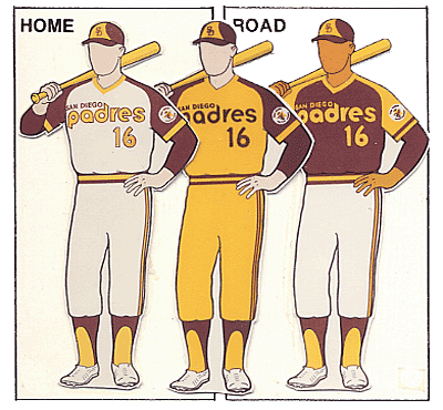
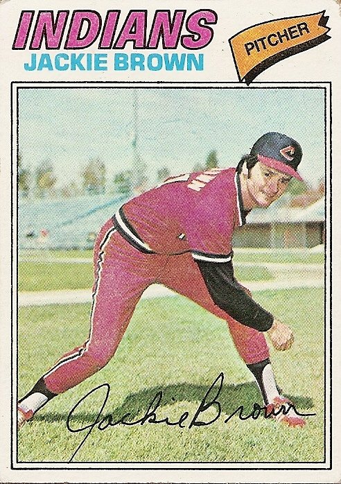
With the recent news of Jordan’s beloved Texas Rangers new uniforms for this season, I thought an appropriate topic would be the all-time most ill-advised uniform decisions in baseball history. One look at those new helmet designs, and you’ll know exactly why I was inspired for this list. I’ve notably omitted all the “Turn Ahead The Clock” designs worn in the late ‘90s because one could make a list entirely consisting of those tragic threads. Also, there were a handful from the 70’s and 80’s that were SO bad, they actually became awesome over time (i.e. Houston Astros’ pre-’93 rainbows, San Diego Padres mustard/brown digs from ’72-’84, the Indians & Phillies all-red “pajamas” from the 70’s, etc.)
So, without further ado…
THE 5 WORST UNIFORMS IN BASEBALL HISTORY:


5. (tie) 1916 Brooklyn Robins (Dodgers) & 1916 New York Giants – two of the best clubs in baseball at the time (Brooklyn won the NL pennant in ’16; NY won the NL pennant in ’17) unfortunately trotted out on game day that season in two of the worst unis ever imagined. Brooklyn sported a blue checkered number that would barely be considered acceptable to wear on a golf course, let alone on the diamond at Ebbets Field. This might have contributed to their losing to Boston in the World Series that year…or, it might have had something to do with a guy named “Ruth” suiting up for the other team. Either way, their unis certainly didn’t help opponents take them seriously. Meanwhile, the Baseball G-Men were sporting a…wait for it…purple plaid design! Wow. They had the greatest athlete in the known world at the time, the legendary Jim Thorpe, and felt it suitable to dress the man in purple plaid. Unforgivable.


4. 1982-1986 Chicago White Sox - After spending the first 70 years of their existence sporting sleek pinstripes and a cool logo, Sox ownership decided that the team needed a new look. Black and white became red and white. Then they ditched and pinstripes altogether and went blue and white (I’ll get to these later). Finally, in ‘82, the ChiSox showed up for opening day in this terrible, half-assed attempt at being fashion-forward. After all, it was the 80’s! Everyone else was trying to look as ridiculous as possible; why not join in the shenanigans? It’s as if the designers thought to themselves, “Three big block letters on front, with bland stripes and colors…what else could you possibly need!?” Fortunately, by 1990, the team had come to their senses. Back were the pinstripes, and with it came the classic black and white colorway. Just like the Baseball Gods intended.


3. 1977-1984 Pittsburg Pirates – Of all the truly awful uniform color combinations over the years, the Bucs take the cake with these. It’d be one thing if the yellow was more subtle like they’ve moved toward in recent years (although *these* are definitely honorable mention for this list). But, oh no. Let’s let the yellow totally dominate the black so far as to also wear yellow pants that can most aptly be described as “hideous”. Top it all off with those nasty “pill box” hats with the horizontal yellow piping, and you’ve got a recipe for a historically bad idea in athletic wear.


2. 1998-2000 Tampa Bay (Devil) Rays – Tampa jumps up this list for starting off on such a bad note. Your franchise is probably not going to get off to a good start if the first image opposing teams have of you is a tacky multi-colored logo, and a cartilaginous fish on your team cap (luckily, the team abandoned the “fish caps” after only one season…to switch to an almost-as-bad multi-colored “TB” logo). From what I gather, the color fade on the jersey logo was supposed to represent the sun reflecting off the bay. What it actually looked like was a bad practical joke. I should also mention that I think it's no coincidence that the year Tampa changed to a nice, newer, cleaner look, the team had their first ever winning season and advanced to the World Series…I’m just sayin’…


1.1976-1981 Chicago White Sox – Oh my dear God. What the hell were they thinking!? A collared baseball jersey? And not just a normal little collar either. I’m talking a “1976-leisure-suit-with-a-big-pointy-butterfly-collar” collar. And, if you thought for a second, “Well, there’s no way to get worse than that”, it does. For one game during the ’76 season, the team actually wore shorts! Not regular knee-length shorts. I mean tiny little 1976 shorts. In a regular season baseball game. On the field. I can’t imagine how embarrassing it must have been for Goose Gossage and the boys to even suit up that day. Pair those appalling little shorts with some granny socks, the cheapest looking cap ever made, the aforementioned collars, and you’ve got, without question, the single worst uniform EVER.


So all you Rangers fans out there, keep your head up. A) The unsightly powder blues Texas wore ’76-’82 didn’t make this list, and B) your team’s new attire doesn’t seem so bad now, does it?
3 comments:
Excellent post, Pop Newmo. Nice shorts there on the ChiSox...haha
I also wanted to throw out that the pitcher in the link for the Indian's uniforms is named Jackie Brown. Awesome.
Personally, I like the new Rangers stuff. And they seem to play very well in the "Reds'" as well. So, whatever works I guess.
Post a Comment